|
Uniting People And Place brochure helps establish Gibson as the Southeast’s premier resource for landscape services
Alpharetta, GA — May 24, 2016 — When Gibson Landscape contacted Voorstellen in early 2016 they were not the same firm that the integrated visual communications agency had helped nearly six years prior. Now with a resume showcasing several high-profile landscape projects and a growing reputation well beyond the Atlanta metro area, Gibson needed a facelift – a new look and feel commensurate with the caliber of clients and larger-scale projects that they were now attracting.
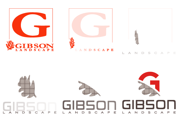
After developing a new brand for the firm (below right) that elevated – but strategically avoided abandoning elements of the previous logomark (click here to view the logo transition) – Voorstellen was charged with developing, writing, and designing a brochure that conveyed the new Gibson Landscape.
After careful consideration, the emerging theme (and the company’s new tagline) brought together two variables that are key to Gibson’s success – Uniting People and Place.
“So much of what we do is transformational . . . we take materials in their raw form and turn them into something beautiful . . . being mindful that we can maintain that beauty for a long time,” said President and General Manager, Tony R. Gibson. “People refers to our solid client relationships, the commitment of our employees, and those that live, play, and work in the space we‘ve created . . . ultimately, we’re building experiences that people can enjoy,” he continued.
The resulting 66-page brochure – replete with dramatic, 28-inch-wide pullouts of Gibson’s most impressive landscape transformations – seems more at home as a coffee table “look book” than a demand creation tool. Intentionally so. “We build the beauty that drives our passion, but it requires clients who recognize the value and share our belief that beauty matters,” Gibson stated. As such, the brochure was shared with screened professionals who share the Gibson philosophy. This group – comprised mainly of architects, landscape architects, urban and regional planners / designers, horticulturists, construction firm executives, and civil engineers – have a more discerning design aesthetic.
Appealing specifically to this group, Voorstellen designed the brochure with no less than 75 color photographs; clean, geometric graphics; modern, architectural fonts; and spare, tightly-edited copy. “First and foremost, we wanted Gibson’s stunning project imagery to take center stage,” commented Voorstellen principal Gary Voreis. “Everything else needed to enhance those images. And despite the compact, 7x10-inch size, the overall impression successfully reinforces Gibson’s mantra, Uniting People and Place.”
|
 |

|
